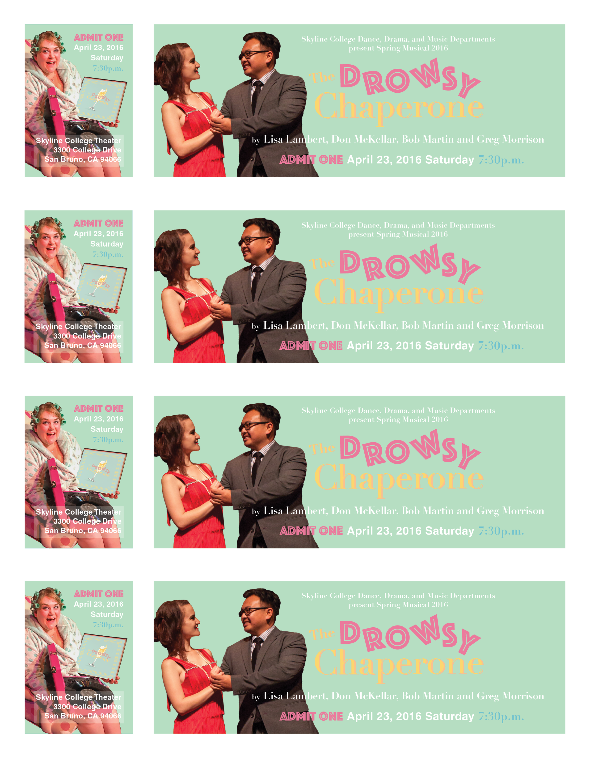
The Drowsy Chaperone
I was requested by Skyline College’s Theater Department to create the advertising for the Spring Play in 2016. This project was a good challenge in working with heavy constraints including necessary branding to allow it to be featured on campus. There were a lot of moving parts implemented into this project working towards its completion. Everything from connecting with the photographer, working with the print house, and continually checking in with the directors led to an insightful learning experience.
In the design process, I wanted to reflect the nature of the show itself and communcate to the viewer what the show is about even before they purchase their tickets. The setting of the show takes place in the late 1920’s and so I incorporated elements of Art Deco within the design. The golden, intricate frame which borders the edge of the paper references the design sensibilities of the time. However, I did not want that to be the sole element to my design choices. I wanted the colors to create a whimsical tone in line with the comical tone of the parody musical and utilize the bouncing letters to communicate the bumbling, ridiculous characters presented within the show.


